Voicing the Keyboard Branding Mayfield Singers
When I auditioned for Mayfield Singers over a year ago, I saw that telling glimmer in their eye. I wish it had been for some gushingly dulcet baritone vocal performance I gave. I think what they saw was a web designer and they threw open the gates for my “talents.” Whatever the reason for my admission, itʼs been refreshing to limber up my joints on a design project. My code‑heavy job doesnʼt allow for that as often as Iʼd like.
The Logo
But Mayfield Singers already had a logo! Are you so arrogant to assume you could do it better? No, that wasnʼt the spirit in which this change was made. As we started to incorporate social media and a new website into our publicity strategy, we realized that there were a few ways a new logo might serve those use cases better.
The gist of it is, we need a logo system that is flexible enough to work with different background colors, alignments, sizes and orientations to perform in a volatile digital world. It has to work as a tiny social avatar on a four-inch screen and then printed huge on an event poster!
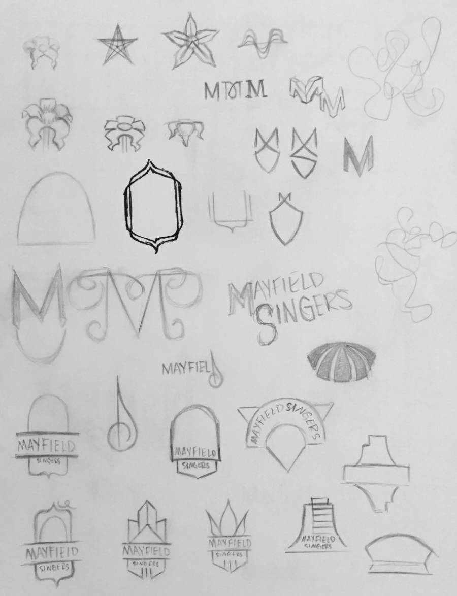
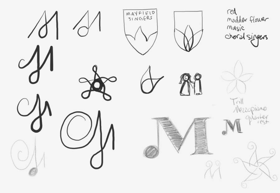
The word Mayfield refers to a plant that grows a small white flower and red roots used for making dye. Iʼm delighted when a brandʼs color choices have some actual relationship with the concept. In this case, the plantʼs red roots and white blossoms made an easy, but purposeful color choice possible. I sought a deep, noble red that would bring dignity and esteem to the brand.
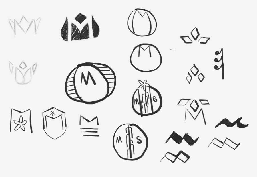
I considered so very many musical symbols for use in the logo. Yet, I am also so very cliche averse. As beautiful a glyph as it is, you would have to hold a hot poker to my eye to get me to put a treble clef in a logo. But in one version of the logo, I included a dot just above the M in the badge that effectively turned the upper half into a fermata. It was clever, and introduced a flavor of musicality, but I opted to abandon it because it created a bullseye that sucked all of the visual attention into it. The M and the flower made for plenty of symbolism on their own. And yet, Iʼm still pleased that some see hints of an an open music folder in the logo, or even a mouth in the act of singing (like with a forked tongue, maybe?).
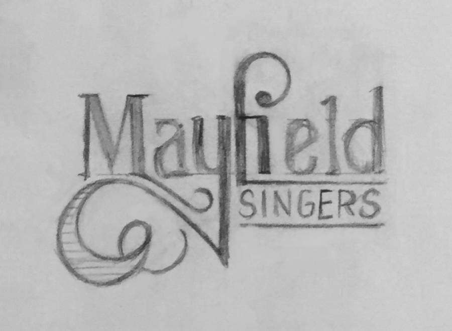
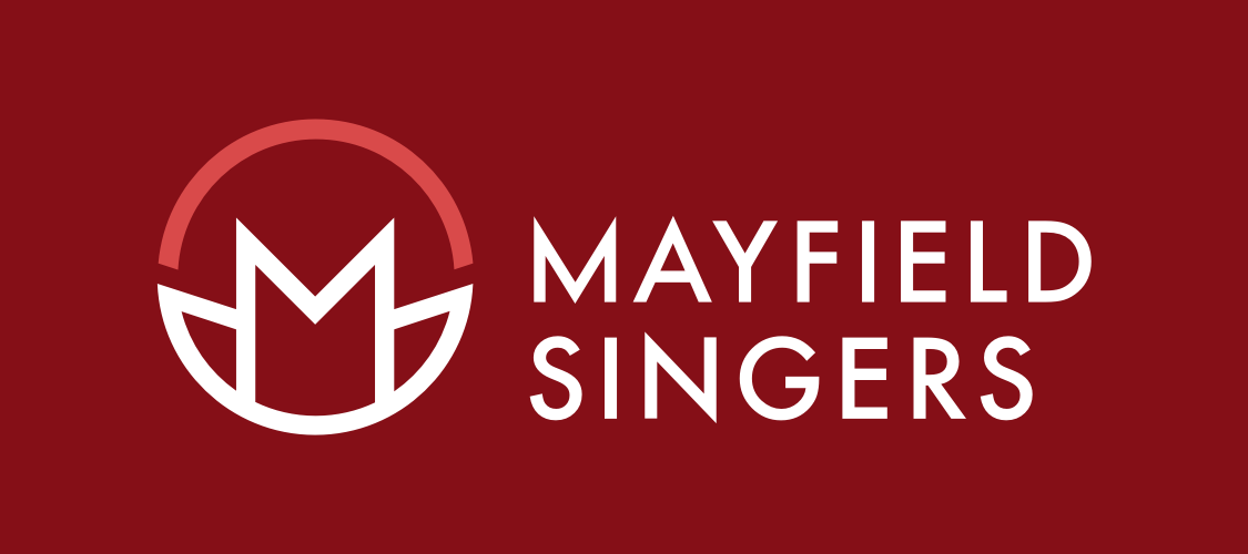
Futura is such a beautiful typeface, but designers use it a lot — myself included. So I tried many alternatives, but none paired with the badge anywhere near as well as Futura with its geometric shapes and even strokes.  But the way the M and the A slant away from each other leaves a loud, ghastly space. And also because it would match better with the M in the badge, I chose to alter the M in the word mark. In doing so, I gained an understanding for why the Futura M is the way it is. By straightening up the stems, it creates thick blocks of color at the apexes that defy the evenness of the strokes. But the space was more egregious to me than a bit of extra ink. So it stayed.
To see more color variations of the logo, visit the styleguide.

The Website
My next priority was to launch the Mayfield Singers website so we could centralize our online presence that was scattered across various social media platforms.
As you may notice in my wireframe sketches below, I once planned to have the group portrait in the header as a backdrop to the logo. I loved the idea of having smiling faces welcome people to the site. But the logo would have to be quite small to avoid colliding with the human heads in the photo — a task made all the more difficult when the site responds and scales gracefully to the size of every device. It just didnʼt allow for the heroic presentation the logo demanded. And I foresaw a time when we might neglect frequent portrait updates, given that a carefully considered photo plus extensive Photoshop work are required to make it work in the header. So I opted to have it serve instead as an introduction to the roster. But itʼs not so bad. It creates a nice light/dark cadence to the sections.
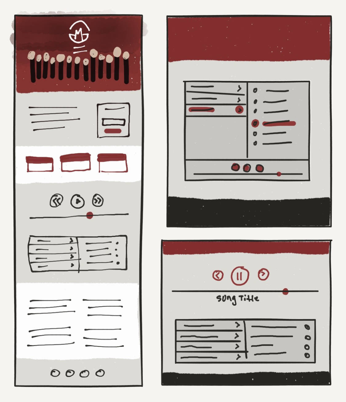
Maybe in part to make up for the lack of musical references in the logo, I decided that some deemphasized notation behind the logo in the header would add some nice texture and context. I grabbed my iPhone and reached into the basket of music by the piano. Based purely on its visual appeal, I snapped a picture of the first few bars of Rachmaninoffʼs Prelude, Op. 3, No. 2, which also happens to be a captivating piece of music.
There were many far easier ways I could have incorporated a music player into the website. But a third-party audio service would get me a branded, mismatched widget that comes with ads or upload restrictions. To get the experience I wanted, I had no choice but to engineer it myself. Noteworthy achievements with the audio player include:
- a simple play/pause/progress UI
- a delightful playlist transition animation
- an auto-play feature
- unlimited song uploads
- an intuitive index file that makes adding, disabling and modifying songs easy
I kept the layout aligned to a 6-column grid so I could have the flexibility to switch between two and three column sections. I hate putting boxes inside of boxes inside of boxes. So as much as possible, I defined the grid using type instead of shapes.
I keep getting thanked profusely for my work on the site as if it were some test of my pain tolerance, when in fact, I really enjoyed myself. Itʼs a delight to give a louder voice and broader reach to something so pure and beautiful.