Designing Joy
I’ve been involved in some capacity with the annual Christmas Crèche Exhibit in Palo Alto for the last four years. I’ve done overnight security duty, sung in choirs, built the website, and contributed an original work of art to the exhibit. I’m devoted. So this year, I thought I’d take on the design of one of the gallery spaces for something of a new adventure.
I was assigned to design the foyer and outside entry to the building. While it is one of the smaller spaces, featuring only nine artworks, it serves as both the entrance and exit to the entire exhibit. So I was given the unique privilege of welcoming and sending visitors off with the right tone.
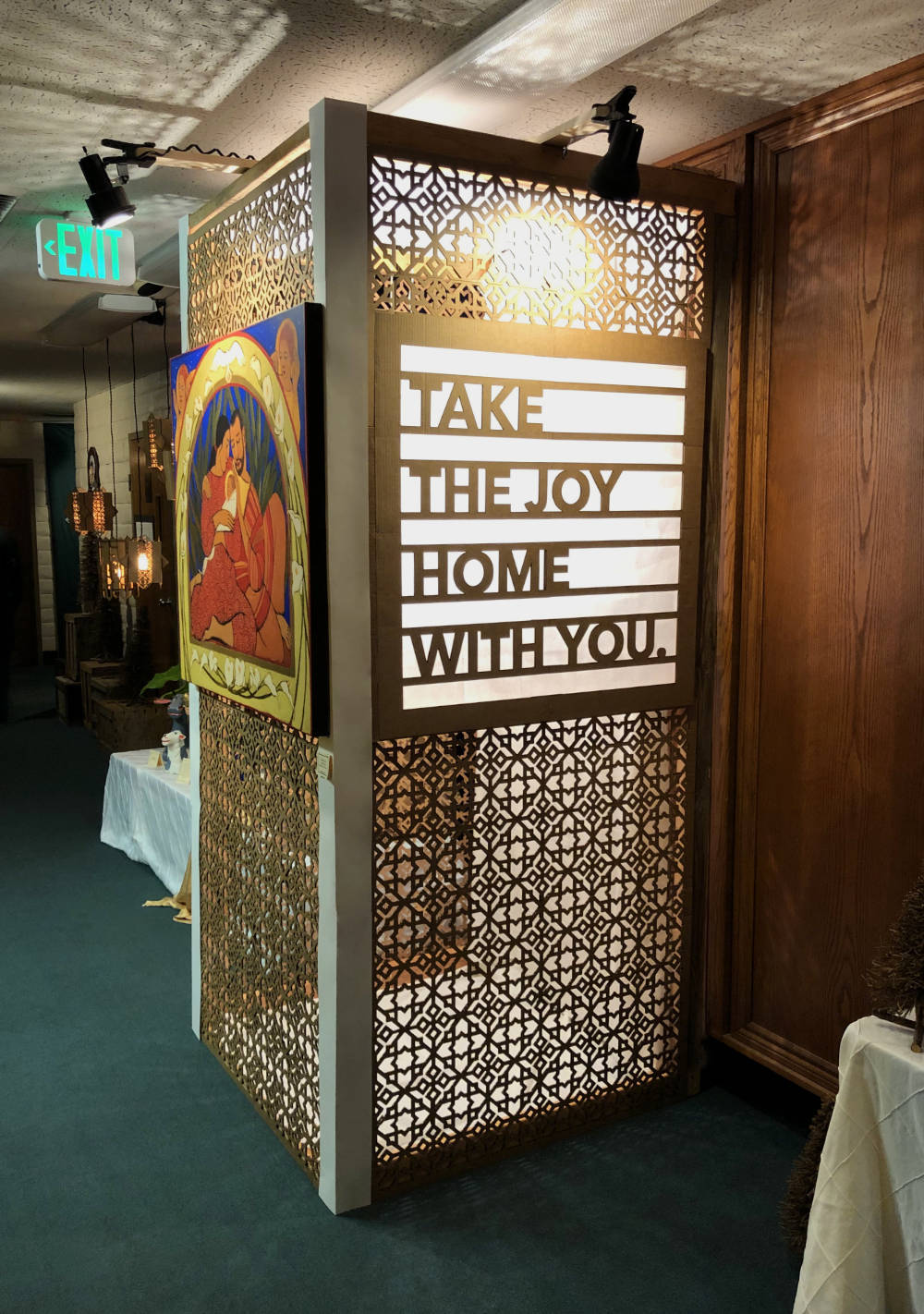
The foyer stars a painting from Kathleen Peterson, one of this year’s three featured artists. The print she sent was about 24 inches square. It’s hard to make a focal point of something so small. Because the back wall of the foyer was so far away, I feared people would miss the painting. So I built a 3½ foot square by 8 foot tall tower that would stand floor to ceiling so I could bring the painting closer to the entry with a statement. During construction, curious onlookers offered plenty of their own hypotheses as to its purpose: a ticket booth, a fortune teller booth, and my favorite: a confessional!
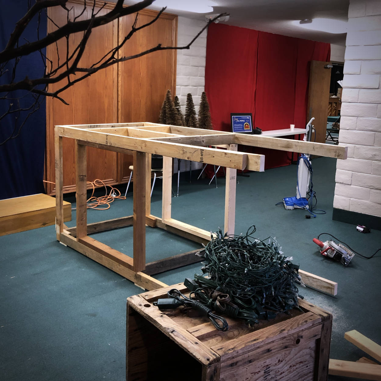
Sadly, the print was damaged during delivery and we had to acquire a much bigger print to display. But at this point all of the parts for the tower had already been made — and my heart sank — until the print turned out to be exactly the size of the space I’d left on the tower for the painting, minus the extra margin I’d built in. What a miracle!
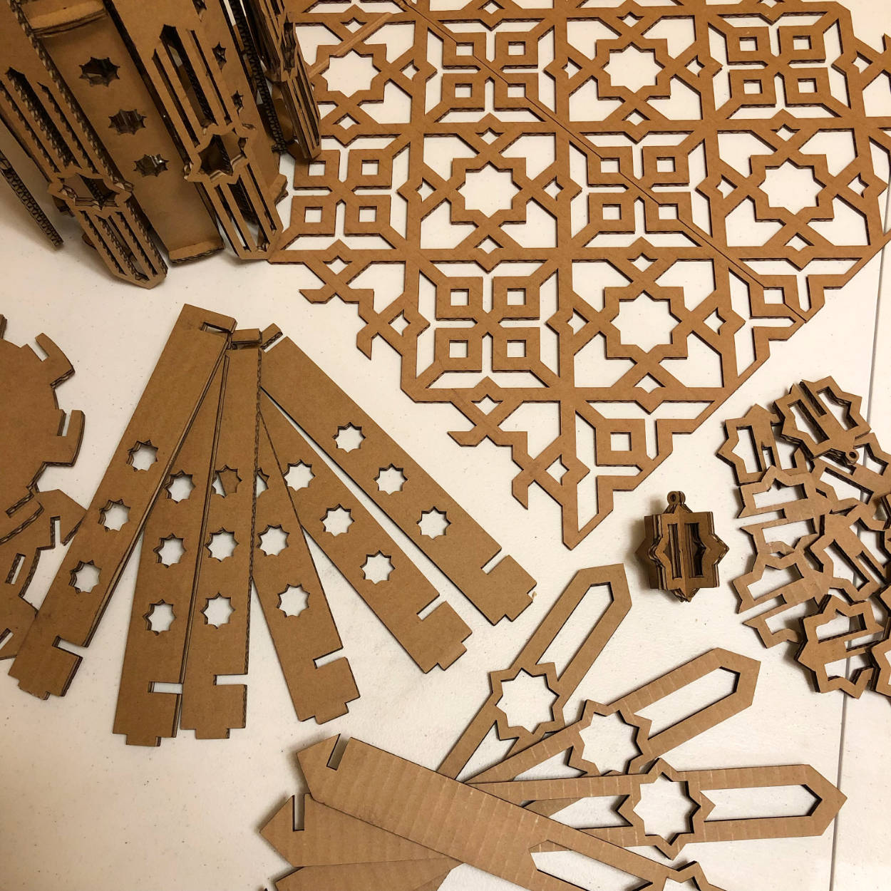
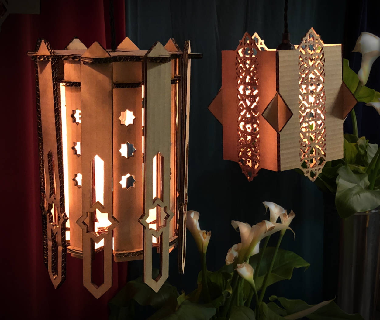
I put my favorite tool, my laser cutter, to work again on this project. With a limited budget, I couldn’t afford to make everything from wood, so I pillaged leftover cardboard from my neighbors to use instead. I made custom lanterns, tree ornaments, backdrops for the nativity sets and, most of all, a custom lattice pattern to affix to the wooden frame of the tower. I’d had a stunning vision of the tower illuminated from the inside with light shining through the lattice to cast patterns on the surrounding surfaces.
This year’s theme was “Joy to All People,” taken from Luke 2:10. I tried to infuse that inclusive invitation in different ways throughout the design. Throughout the exhibit, I repeated an eight-pointed star motif in the patterns I used. The star was the sign given in the sky to all people as an invitation to seek the Christ child. Eight also holds meaning in Christian symbolism representing resurrection, because it is one more than seven, which represents the completion attained at His death and Atonement.
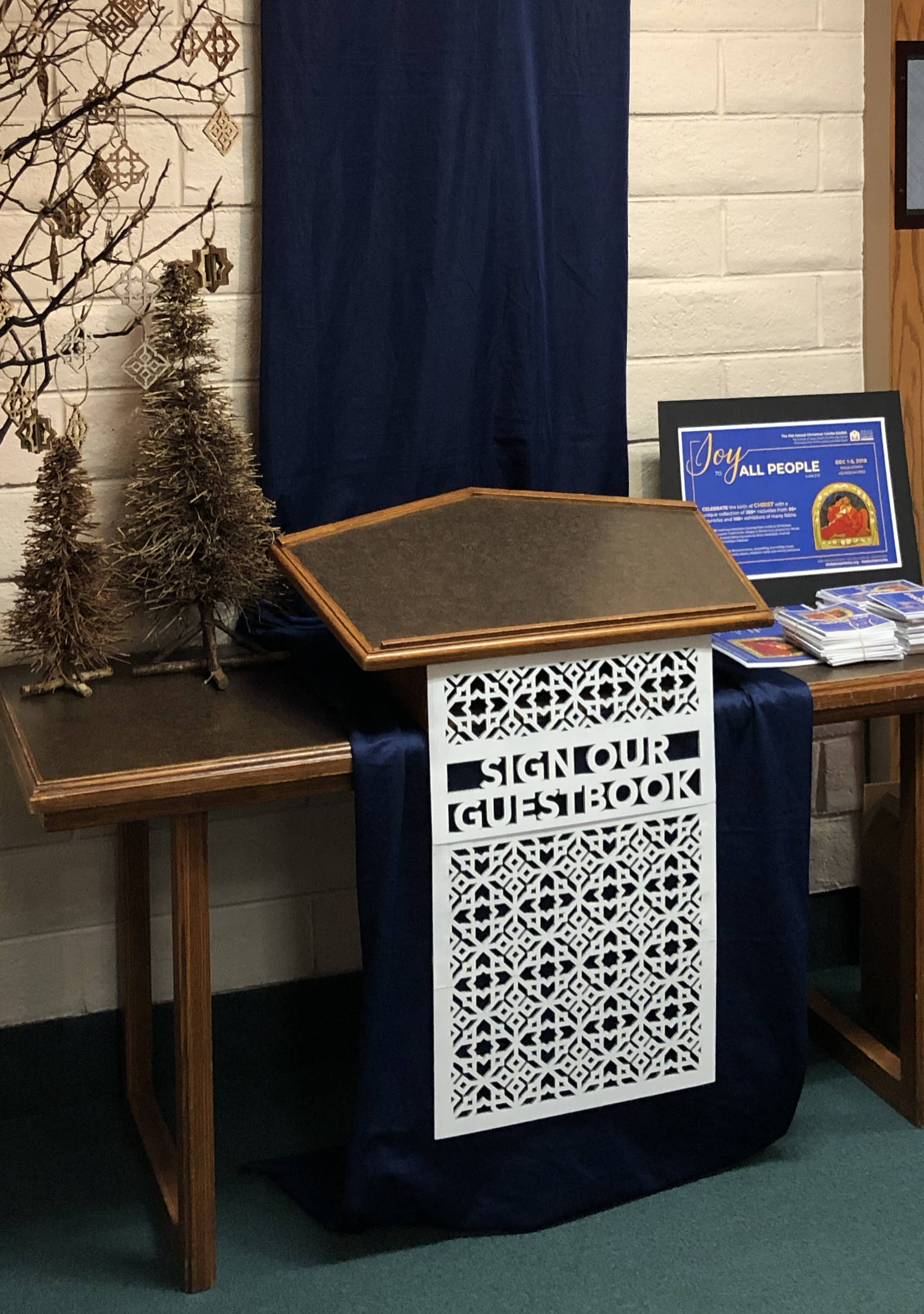
I also used a selection of Red, Green and Blue fabrics as backdrops, not only because the nativity pieces in the foyer, all from the Americas, featured these colors heavily, but also because they are the primary colors of light. From these three colors, any color can be created. And Christ, as the source of all light, created all colors, and people of all colors.

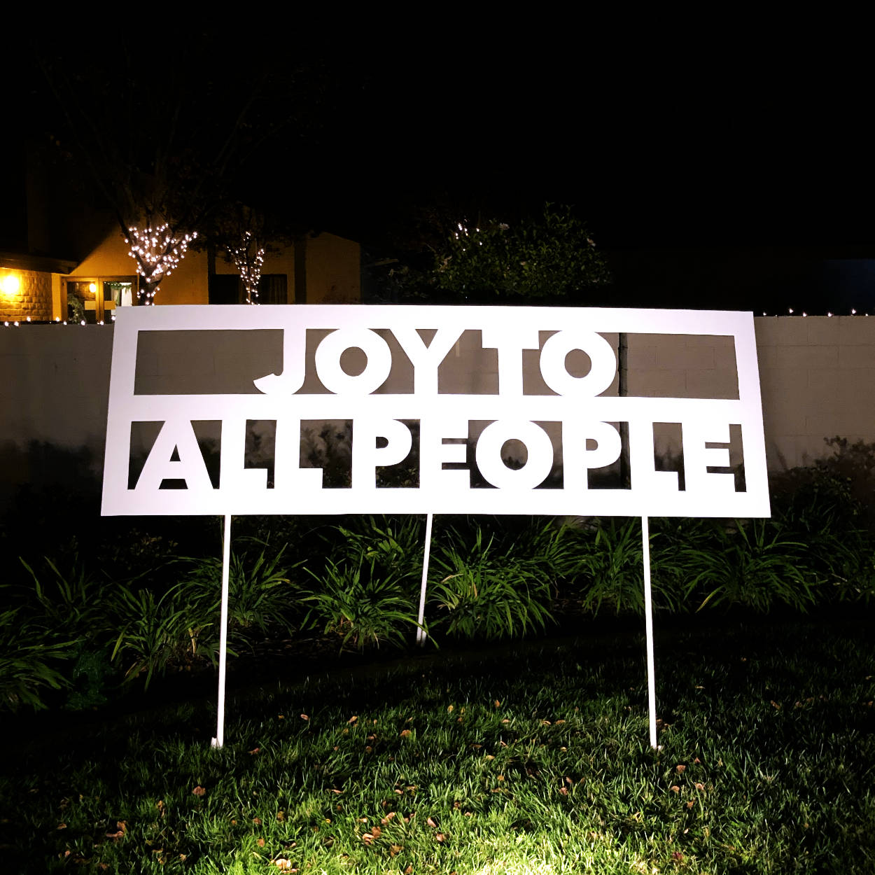
On the two remaining tower walls, I added some messaging elements in the form of two backlit, laser-cut signs. One, welcoming visitors with a partially hand-lettered rendition of the theme, “Joy to All People.” The other invited departing guests, “Take the joy home with you” above a selection of reading materials that support the message of the exhibit.
It was such a thrill to stand aside and eavesdrop as people walked in the exhibit. I think it really did serve its purpose to initiate the joy and wonder that emanates from the beautiful artworks throughout the building. I'm grateful to have been a part of creating that kind of an experience for the thousands of people who visited. And I'm especially grateful for the people who gave me the chance, the people that lent a hand, and the people who through word and deed showed their appreciation for my work.